

Our Logo

  1. Home
  2. Our Logo

Every aspect of the design has Meaning

More than a brand mark — a carefully built identity system that reflects who we are, what we stand for, and how we create value. Every aspect of the design has meaning.

One mark, two domains

Together, these elements tell the SGPC story.

They reflect our dual focus as a consultancy operating across two powerful domains — each reading the same symbols through a different lens.

Experiential Learning

Interactive growth, leadership development, capability building, and human transformation through active participation.

Business Consultancy — Energy Sector, Middle East

Insight, strategic direction, commercial momentum, resilience, and sustainable growth.

How it's built

Four elements, one story.

Stage 01 — Game

Engagement, built in

At its conceptual core is the element of game — a deliberate reflection of one of SGPC's defining strengths: experiential and game-oriented active learning. It represents engagement, participation, structured challenge, problem-solving, and learning through experience. It reflects our belief that true growth happens when people actively think, interact, experiment, and discover for themselves.

Stage 02 — Growth Arrow & Lightning Bolt

Momentum with direction

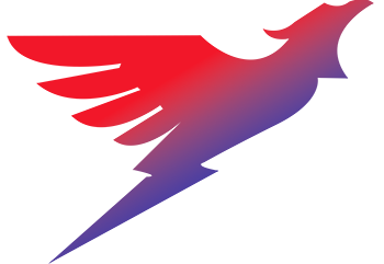
Integrated into the form is an upward growth arrow, expressed with the energy of a lightning bolt. This symbolizes forward motion, momentum, power, hope, and decisive progress — not slow, passive movement, but energized advancement with direction and purpose. It reflects the commercial and strategic side of our work: helping businesses sharpen their trajectory, unlock opportunity, and move ahead with confidence.

Stage 03 — The Phoenix

Rising, by design

Emerging from this movement is the phoenix — the most powerful symbolic layer within our logo. It stands for resilience, reinvention, renewal, and the courage to rise stronger from challenge. Its flight expresses aspiration and elevation, its dynamic posture confidence and strength. Its voice — the implied winning scream within the design — represents conviction, passion, and the boldness to move upward in spite of adversity.

Stage 04 — The SGPC Core

Structure holds it together

At the centre of the logo is the SGPC name, held within a defined frame. This structured core represents strategic thinking, alignment, stability, and partnership. It reminds us that transformation without structure is incomplete — at SGPC, creativity is matched by clarity, and ambition is supported by disciplined execution.

AT A GLANCE

What each element carries

SGPC was founded not simply to participate in business, but to create meaningful impact through it. Our logo is the visual embodiment of that belief.

Watch our coaching videos for practical tools